Found My Fitness
PLATFORM
DESKTOP, MOBILE
SCOPE
UI, UX
PLATFORM
DESKTOP, MOBILE
SCOPE
UI, UX
PLATFORM
DESKTOP, MOBILE
SCOPE
UI, UX
TOOLS
SKETCH APP, ADOBE ILLUSTRATOR, INVISION
YEAR
2017
TOOLS
SKETCH APP, ADOBE ILLUSTRATOR, INVISION
YEAR
2017
TOOLS
SKETCH APP, ADOBE ILLUSTRATOR, INVISION
YEAR
2017
Background
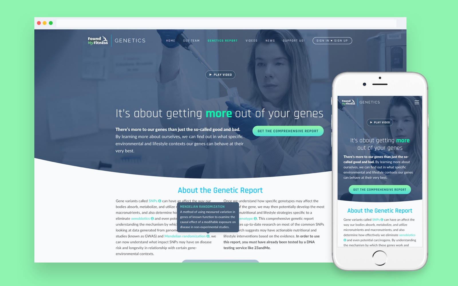
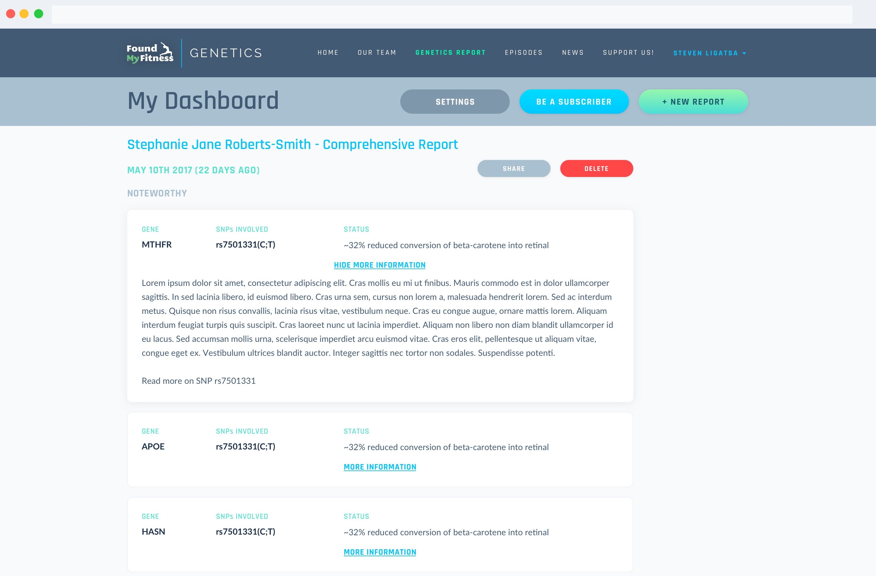
Found My Fitness produces a genetic report based on the individual's DNA data using Dr. Rhonda Patrick’s algorithm. The report can help the user to find out which specific environmental and lifestyle contexts our genes will behave at their very best.
Challenge
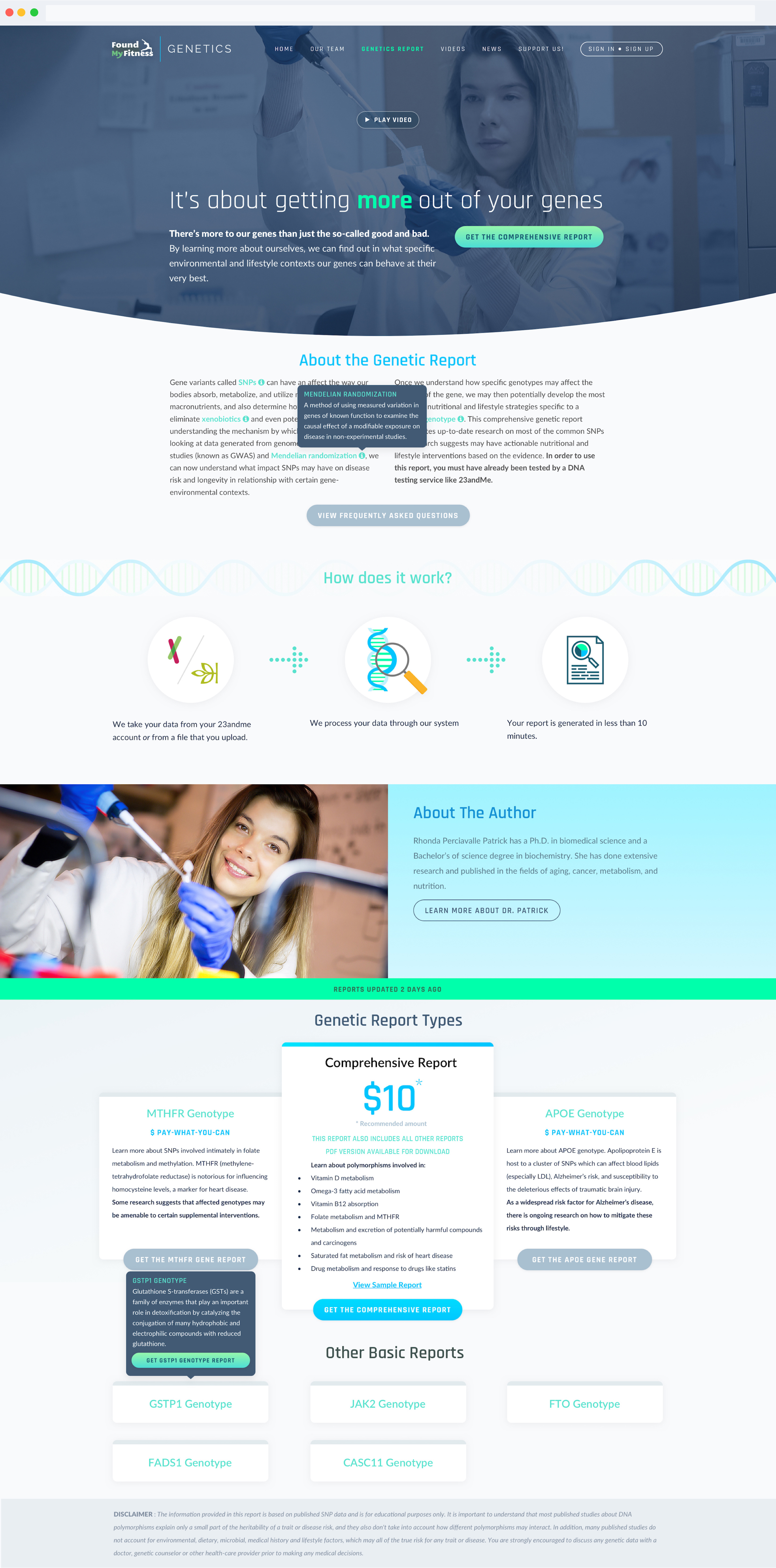
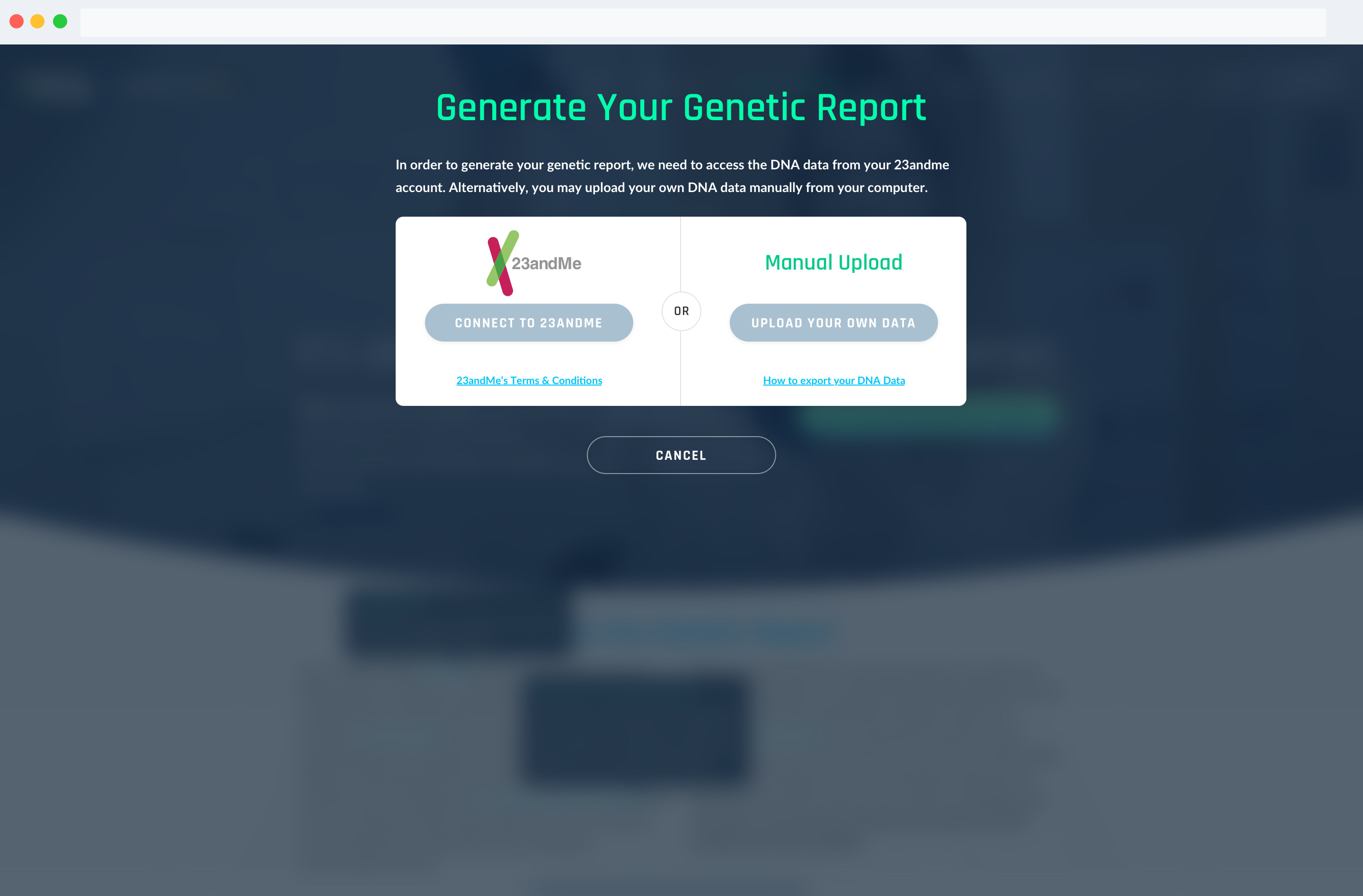
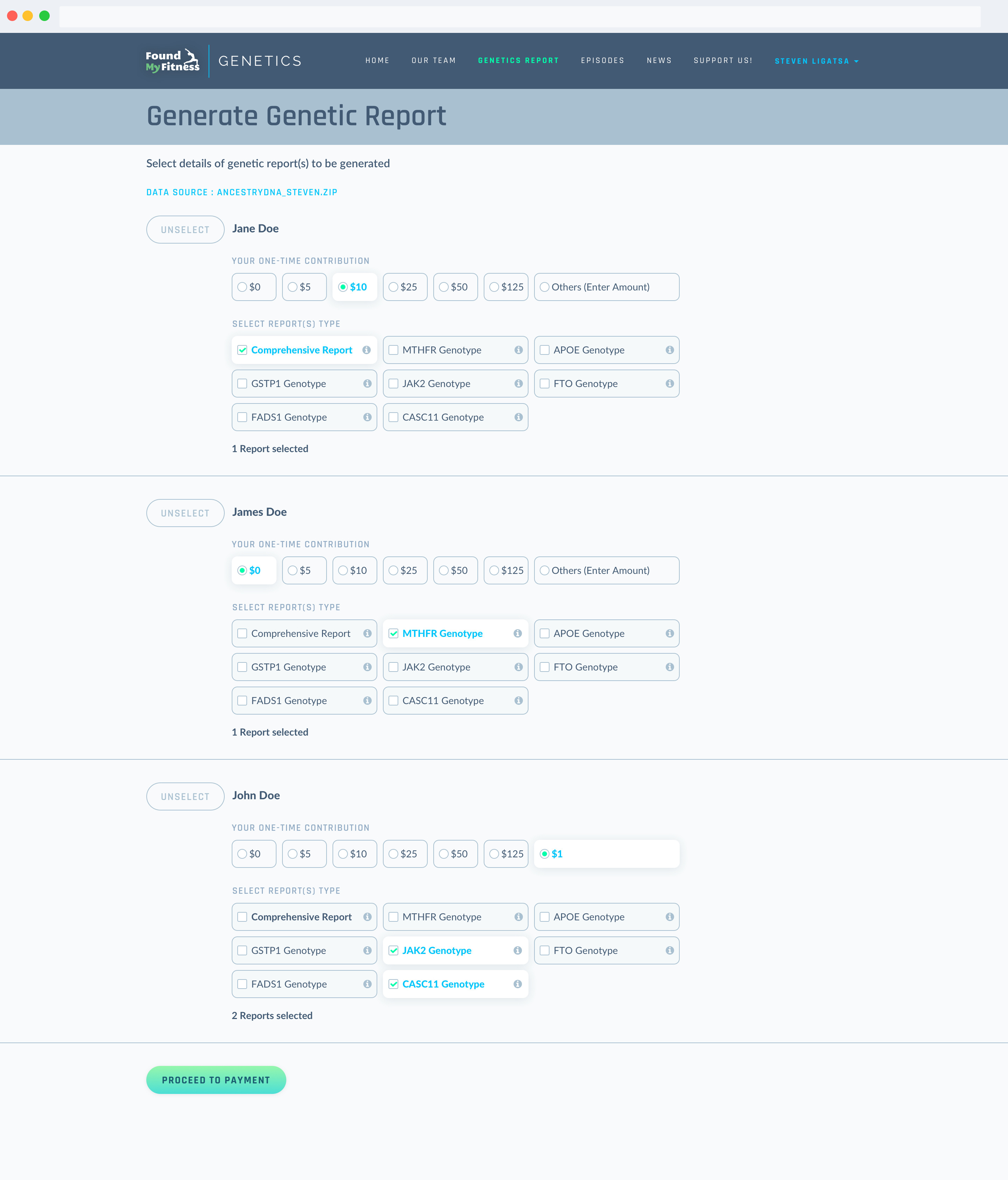
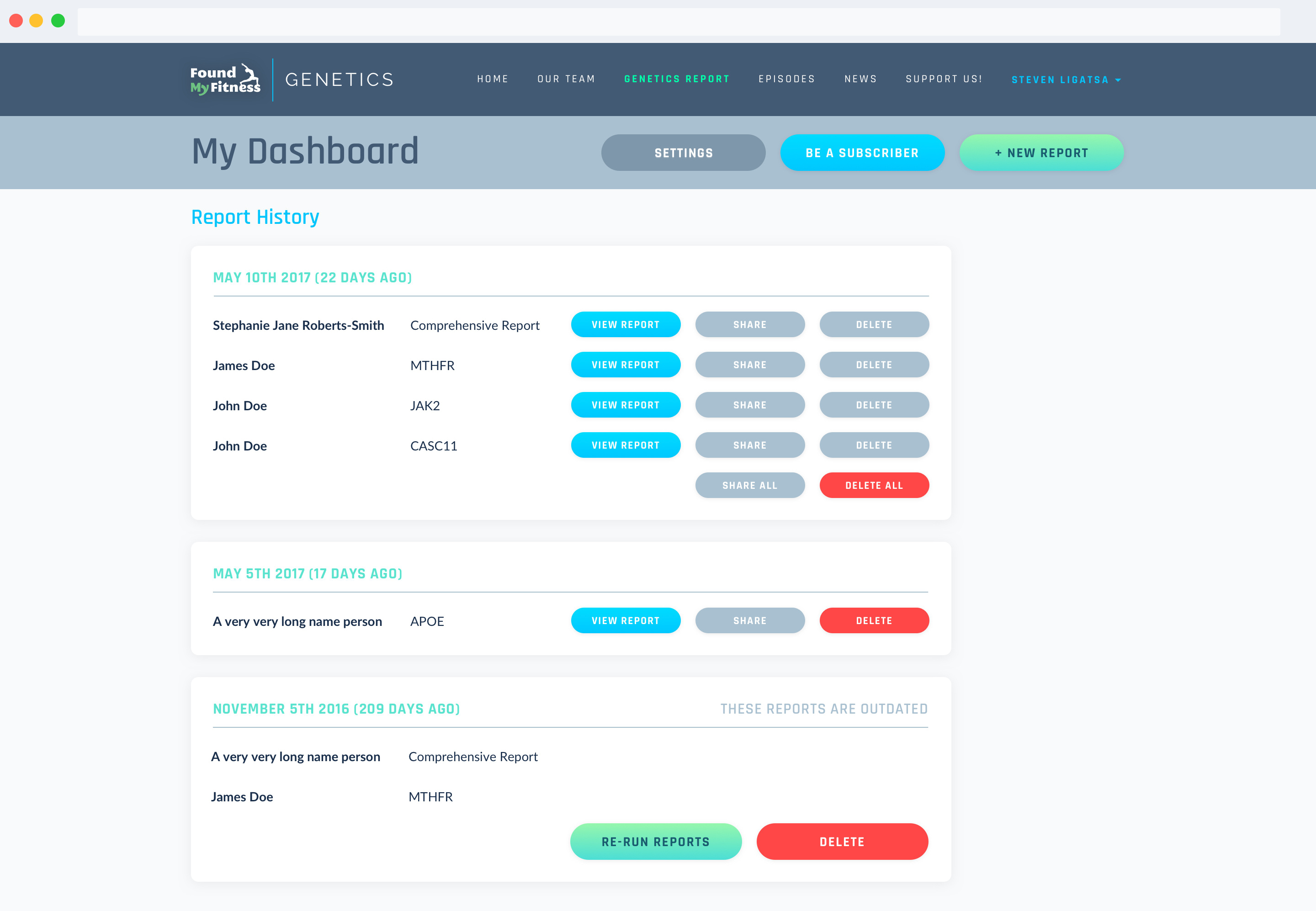
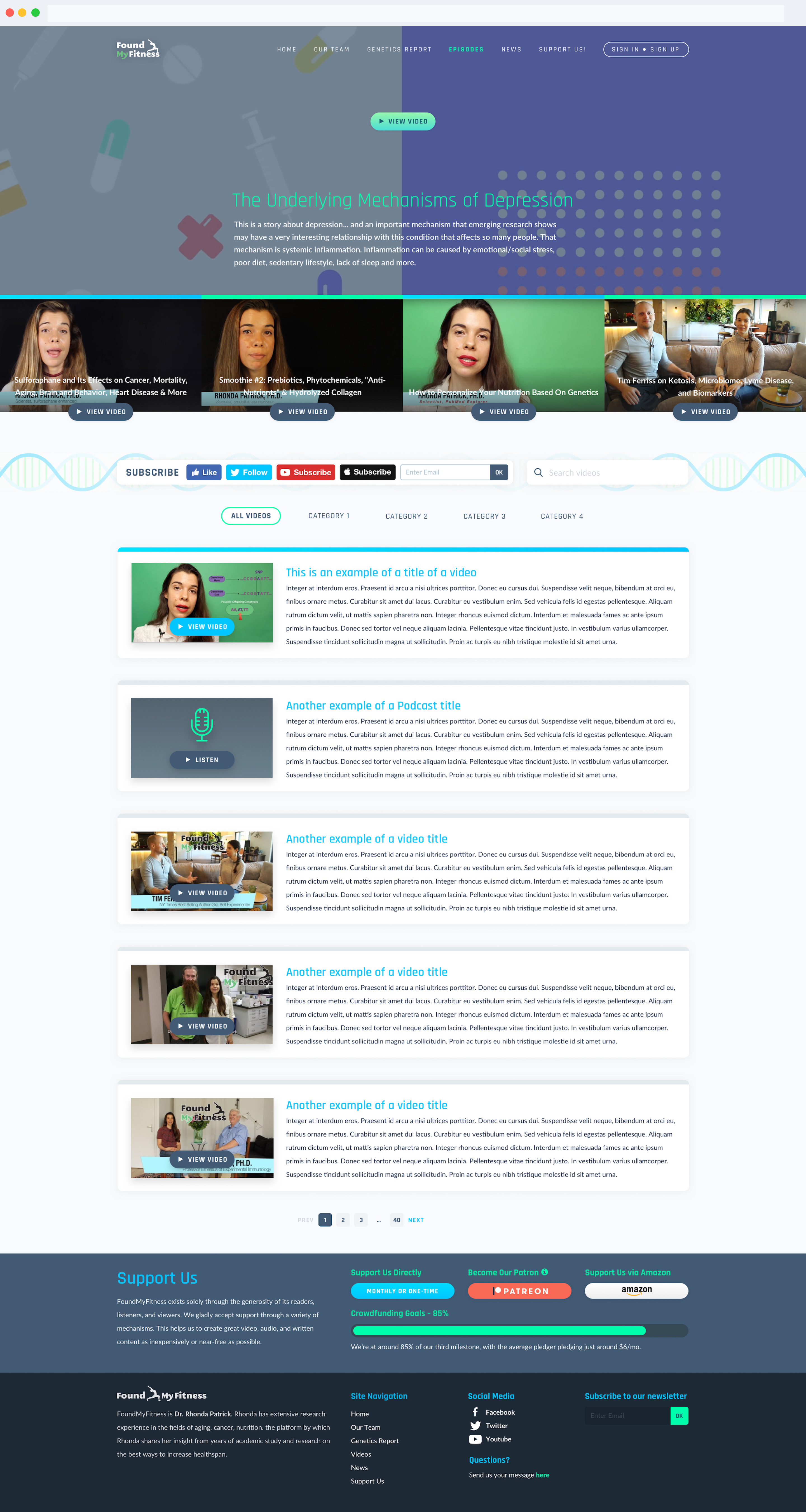
As the sole UI and UX designer, I was tasked with redesigning the existing genetics page and user onboarding flows from the front page until a report is generated. Previously, the page didn’t have a clear structure to it and it didn’t really perform well in terms of explaining to the user about what the report actually does and where it comes from.
Solution
Since one of the main problems of the initial site design was the absence of a clear page structure, this is one of the first problems that I intended to tackle through the wireframing phase. Once the information architecture was solved then the UI design followed after that.
Rationale
At the beginning of the design process, we determined early on that Dr. Rhonda Patrick should be one of the main focuses of the page. The doctor has a sizeable following in the medical community and Found My Fitness sourced its stature and reputation from her.

We can help solve your design problem.
Interested in working with us?
Shoot us an email at inquiry@ligatsa.works.
We can help solve your design problem.
Interested in working with us?
Shoot us an email at inquiry@ligatsa.works.
See our other works
