YouOwnYou by iVirtual
PLATFORM
DESKTOP, MOBILE
SCOPE
UI, UX
PLATFORM
DESKTOP, MOBILE
SCOPE
UI, UX
PLATFORM
DESKTOP, MOBILE
SCOPE
UI, UX
TOOLS
FIGMA
YEAR
2021-2022
TOOLS
SKETCH APP, ADOBE ILLUSTRATOR, INVISION
YEAR
2017
TOOLS
SKETCH APP, ADOBE ILLUSTRATOR, INVISION
YEAR
2017
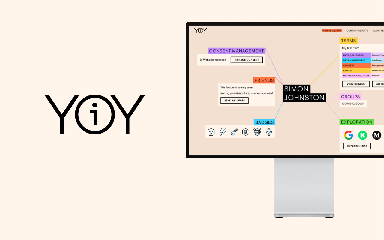
YouOwnYou is a centralized platform for consumers to take complete control and manage their data privacy online. This B2C offering is interconnected with the YouOwnYou B2B platform where businesses could legally and ethically request to access consumer's data by implementing YouOwnYou's Consent Management Banner on their website.
As the Design Lead of the company, I was tasked with designing the complete end to end user experience and interface for the platform. Working hand in hand with the Chief Product Officer of iVirtual, this process started by charting the complete end to end User Journey, to make sure that it would align with the company's product roadmap.
Key Problems & Solutions
Right from the start, we managed some identify key problems that we have to solve through design:
- Data privacy as a subject, seems quite a heavy, serious, and unapproachable from a consumer standpoint.
We intended to tackle this problem by maximizing the usage of our branding throughout the whole platform. Our branding was designed a way that's bold, fresh, and friendly. This was achieved mainly by using bold primary colors and highlighted typography. - The user experience must be simple and easily digestable, but smart and robust enough for more savvy users.
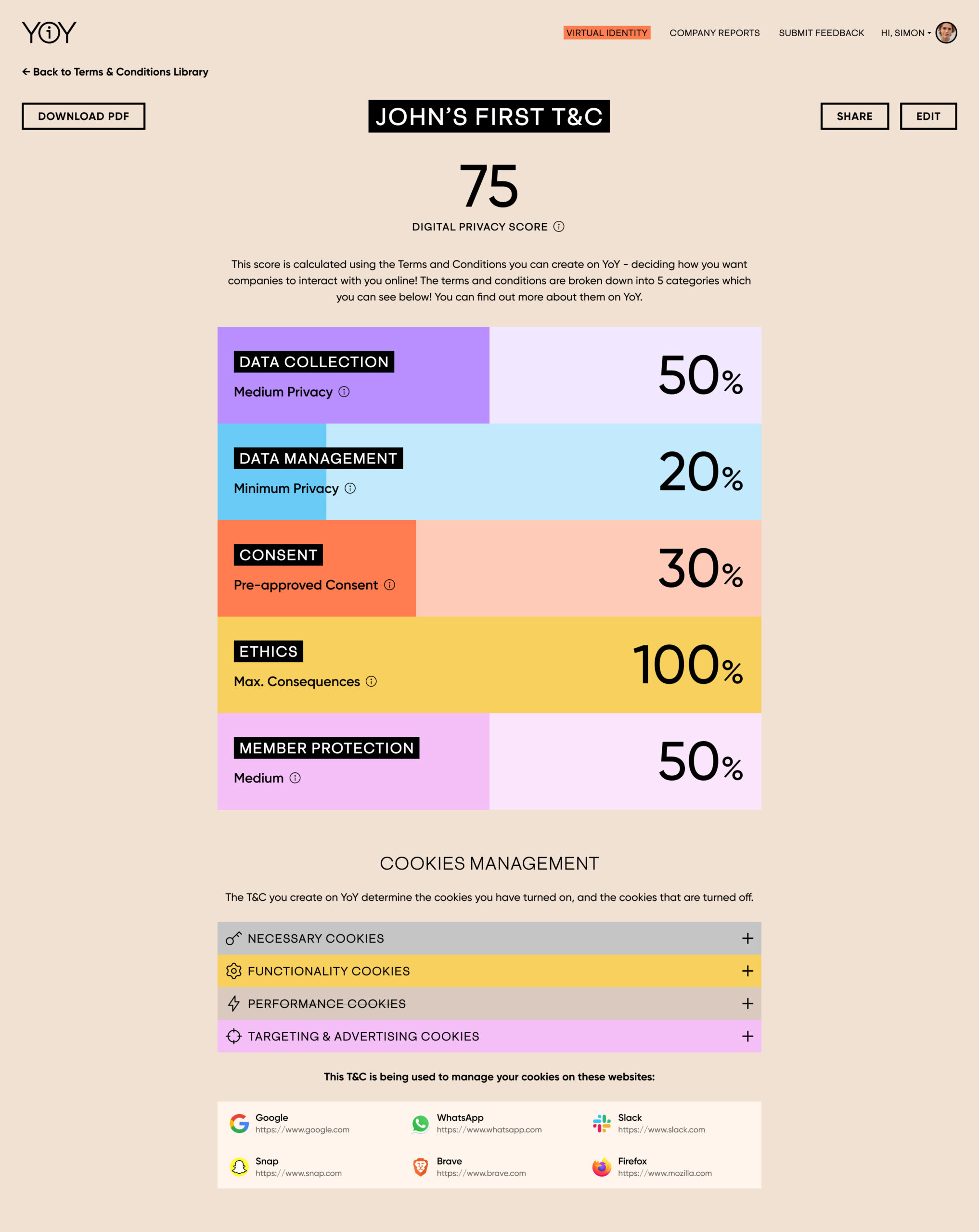
This problem is especially magnified in the Terms & Conditions generator and customizer. Unless your occupation is a lawyer, you probably have not read a single Terms & Conditions that you agreed to, everytime you visit or create an account on a website. In general, this is mostly caused by the fact that T&Cs are generally long and use terms that are difficult to understand for people without legal background. We intend to do the opposite of this with our T&C customizer. We summarized each category according to its strictness level using short sentences and a more 'humanistic' language. This allows the user to understand and grasp the levity of their T&C, with the option to view the full detailed version of it with legal language. - YouOwnYou has to be completely transparent to the user.
This means that absolutely no 'Dark UX Pattern' anywhere in the user experience. Everything on the platform must be legible and clear. YouOwnYou will not attempt to trick or fool the users into doing something that they're not privy to.
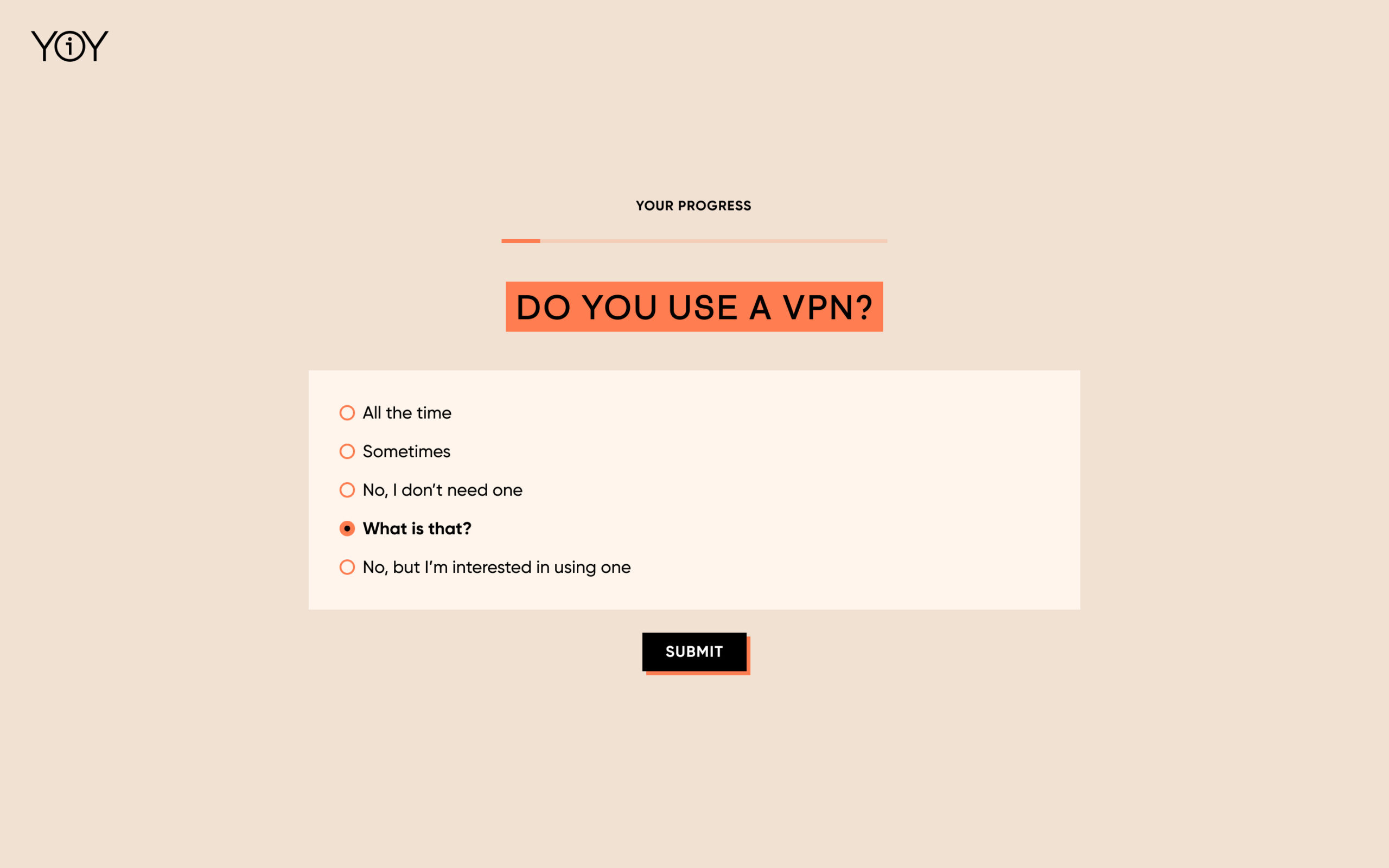
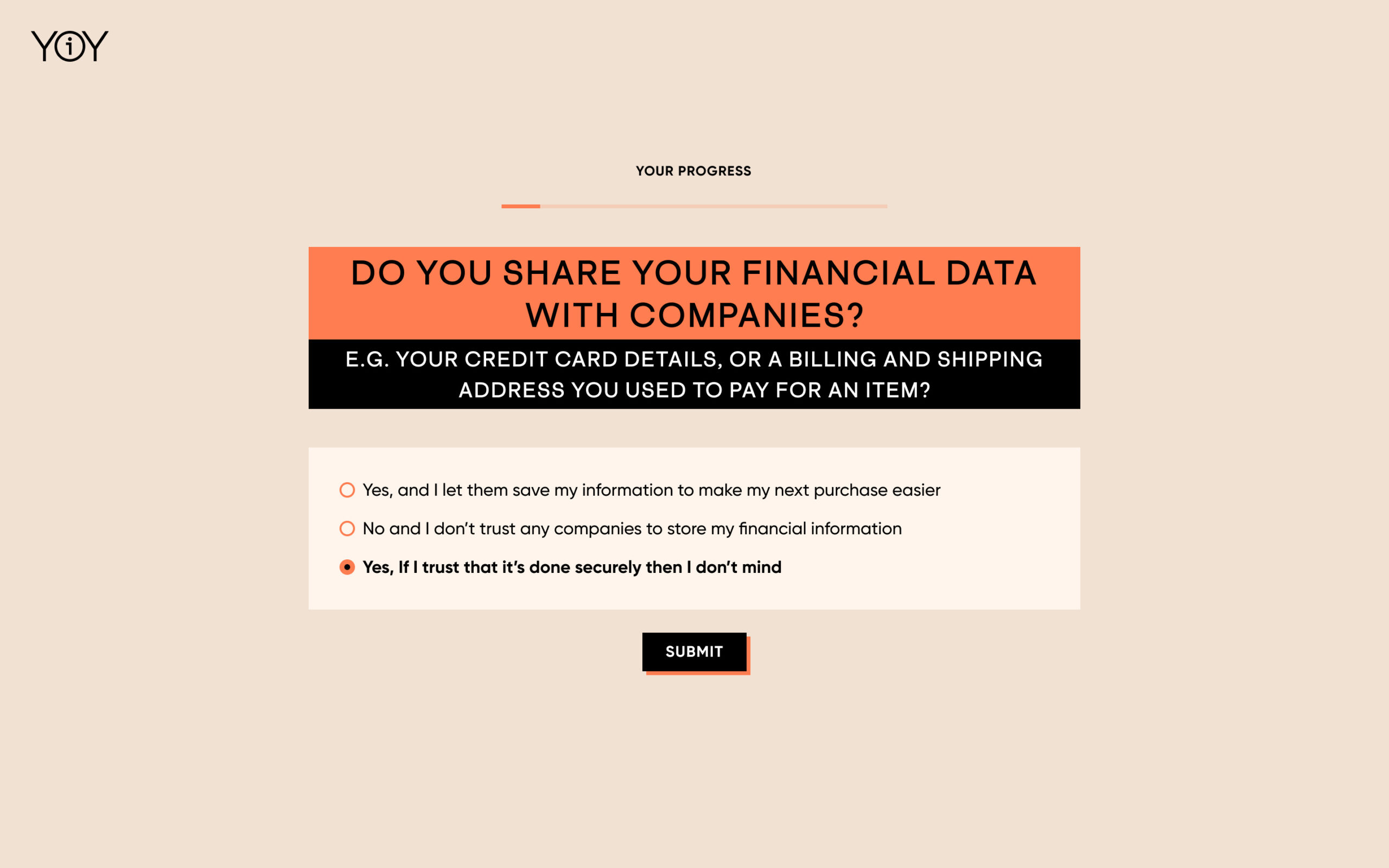
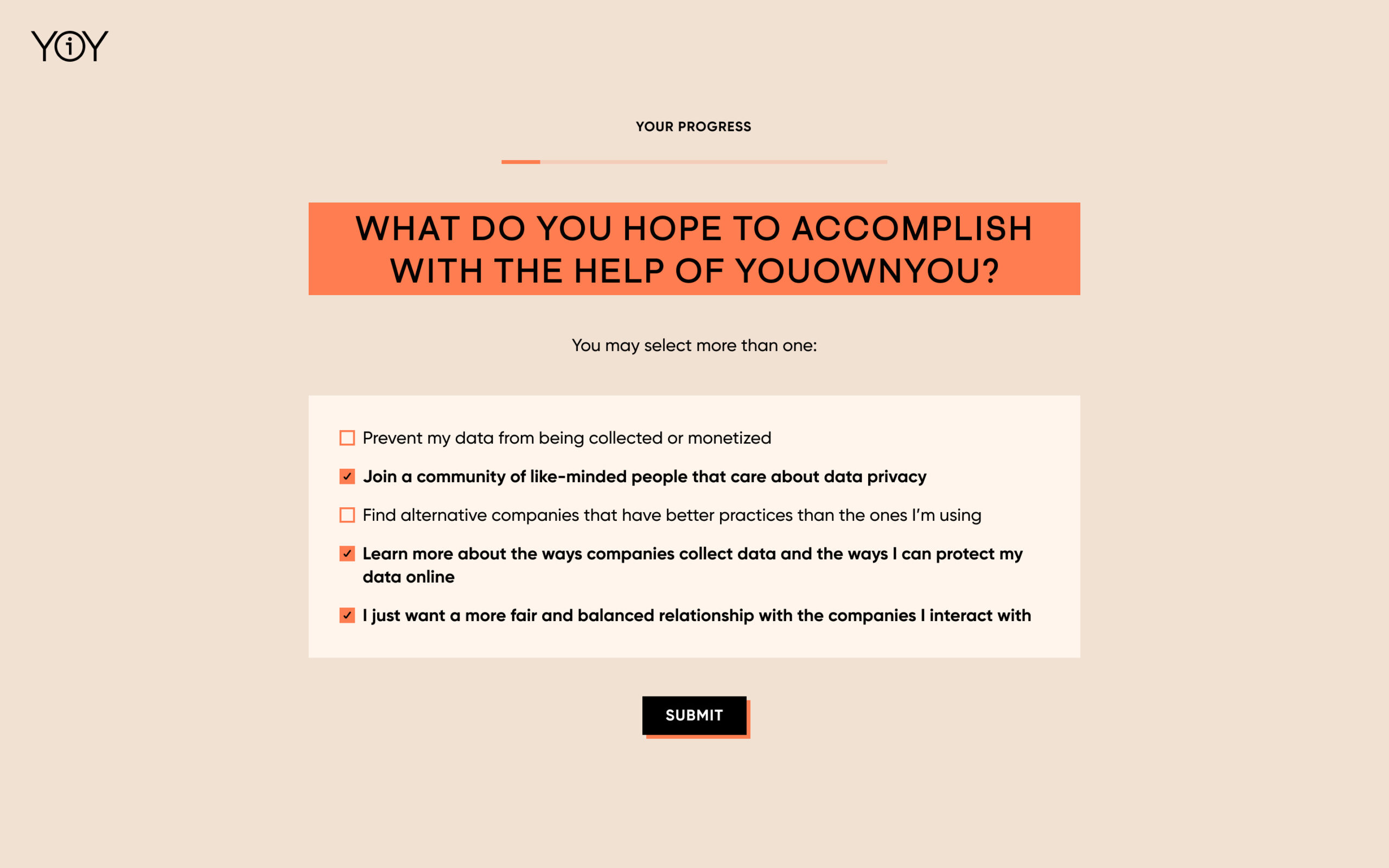
Onboarding - Survey


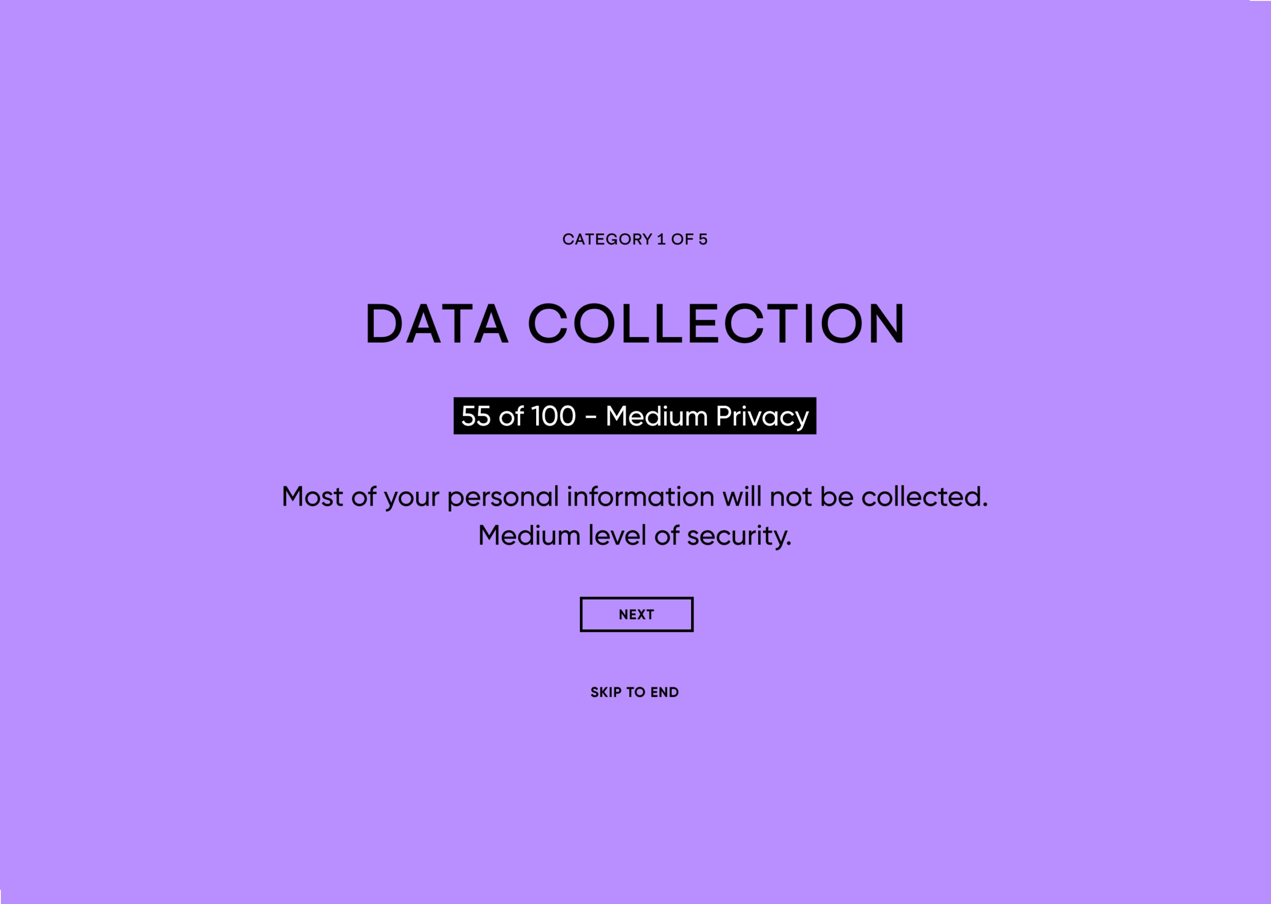
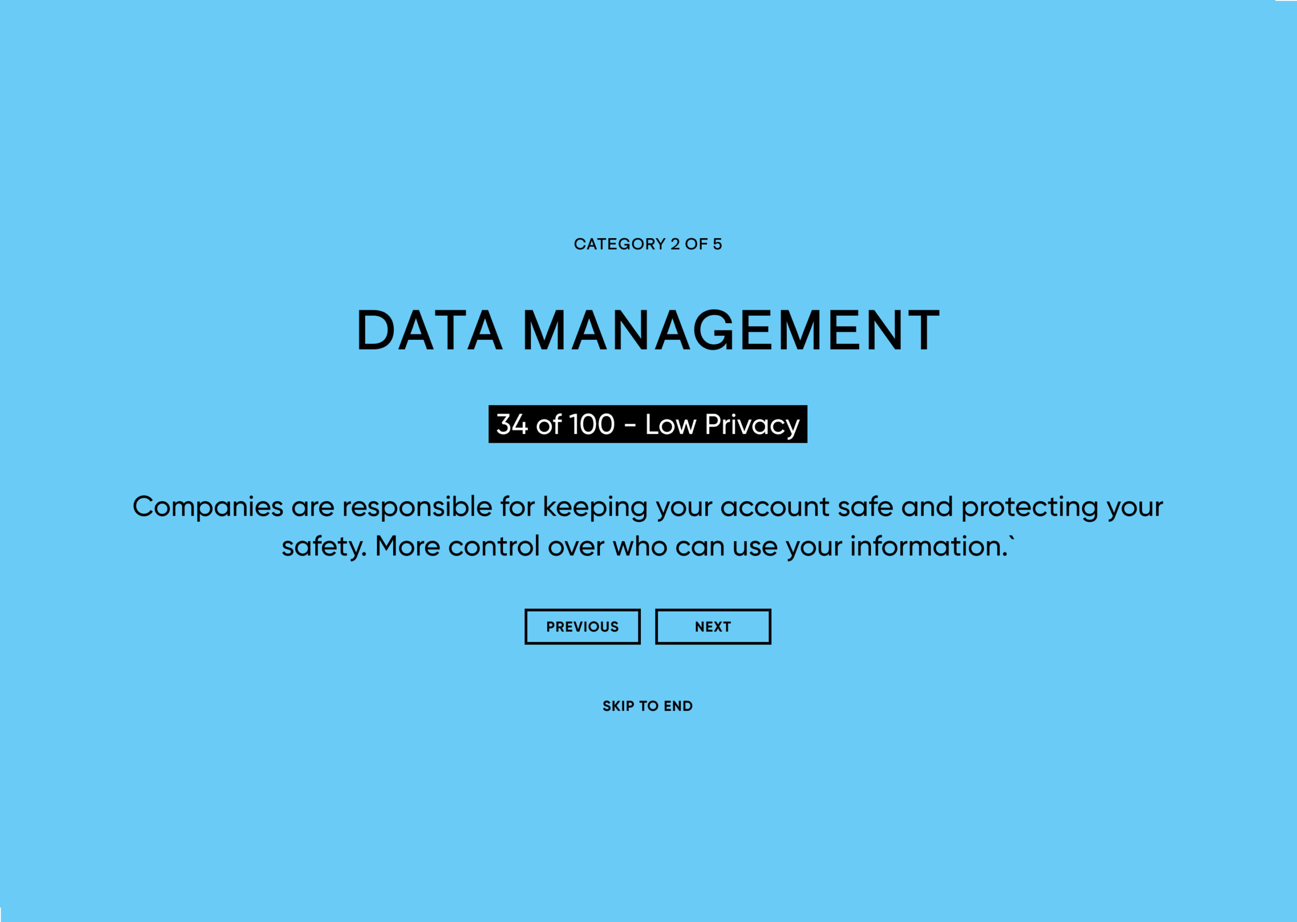
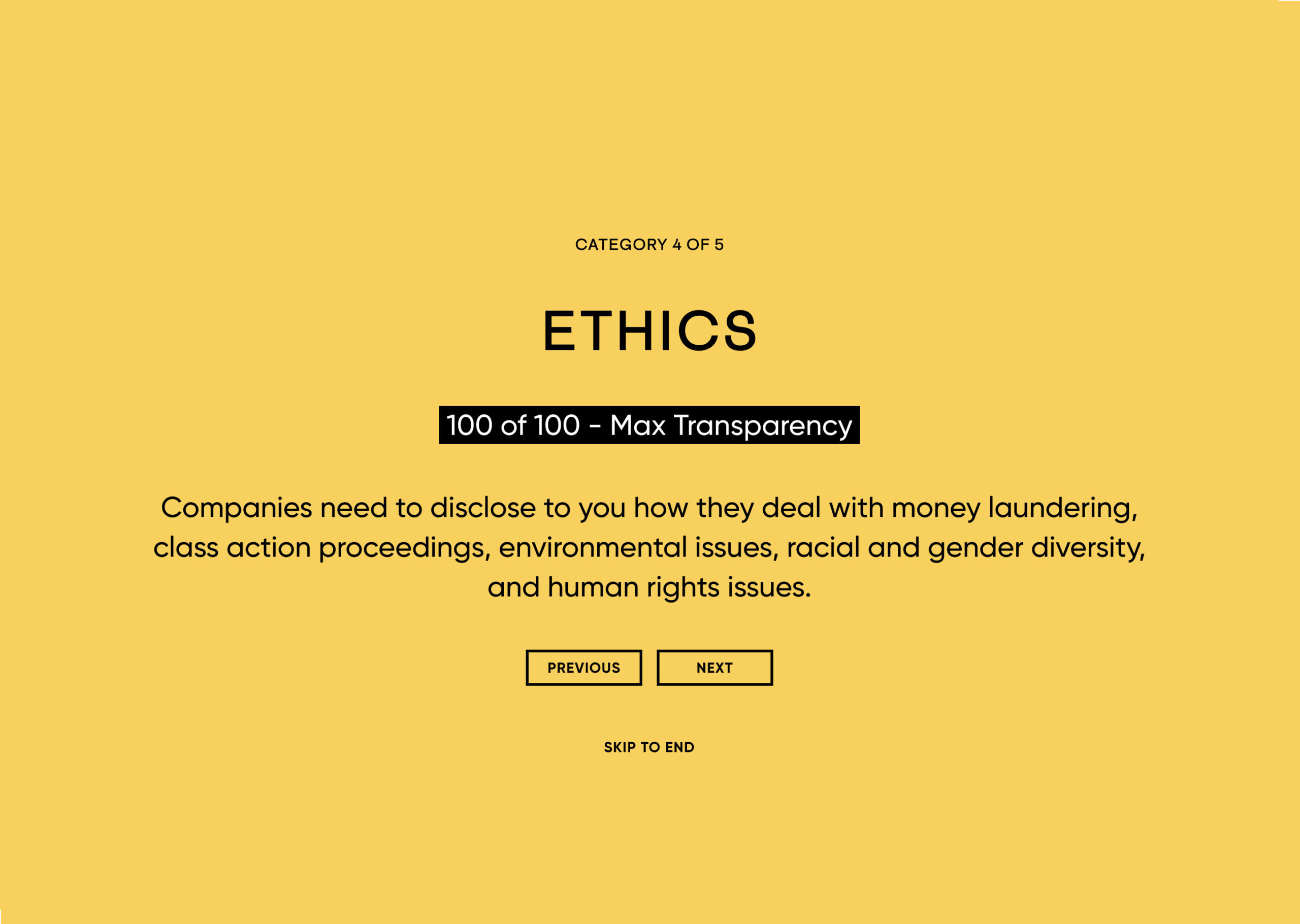

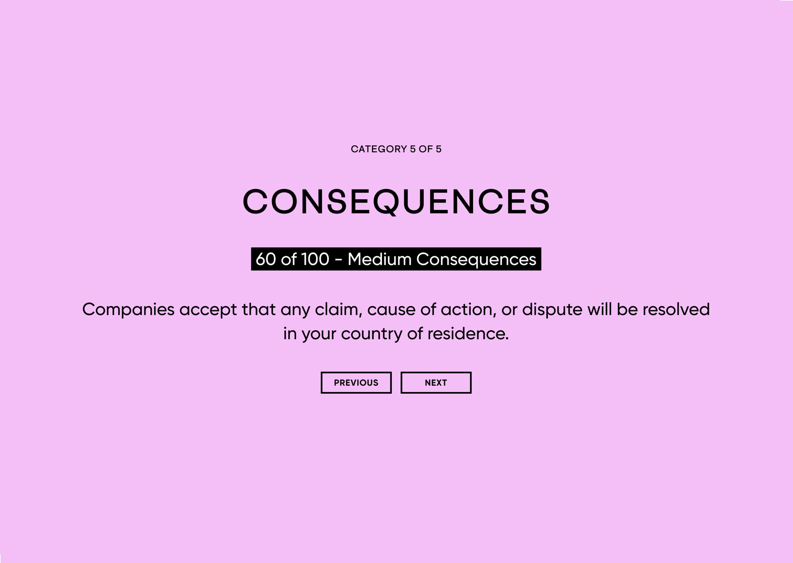
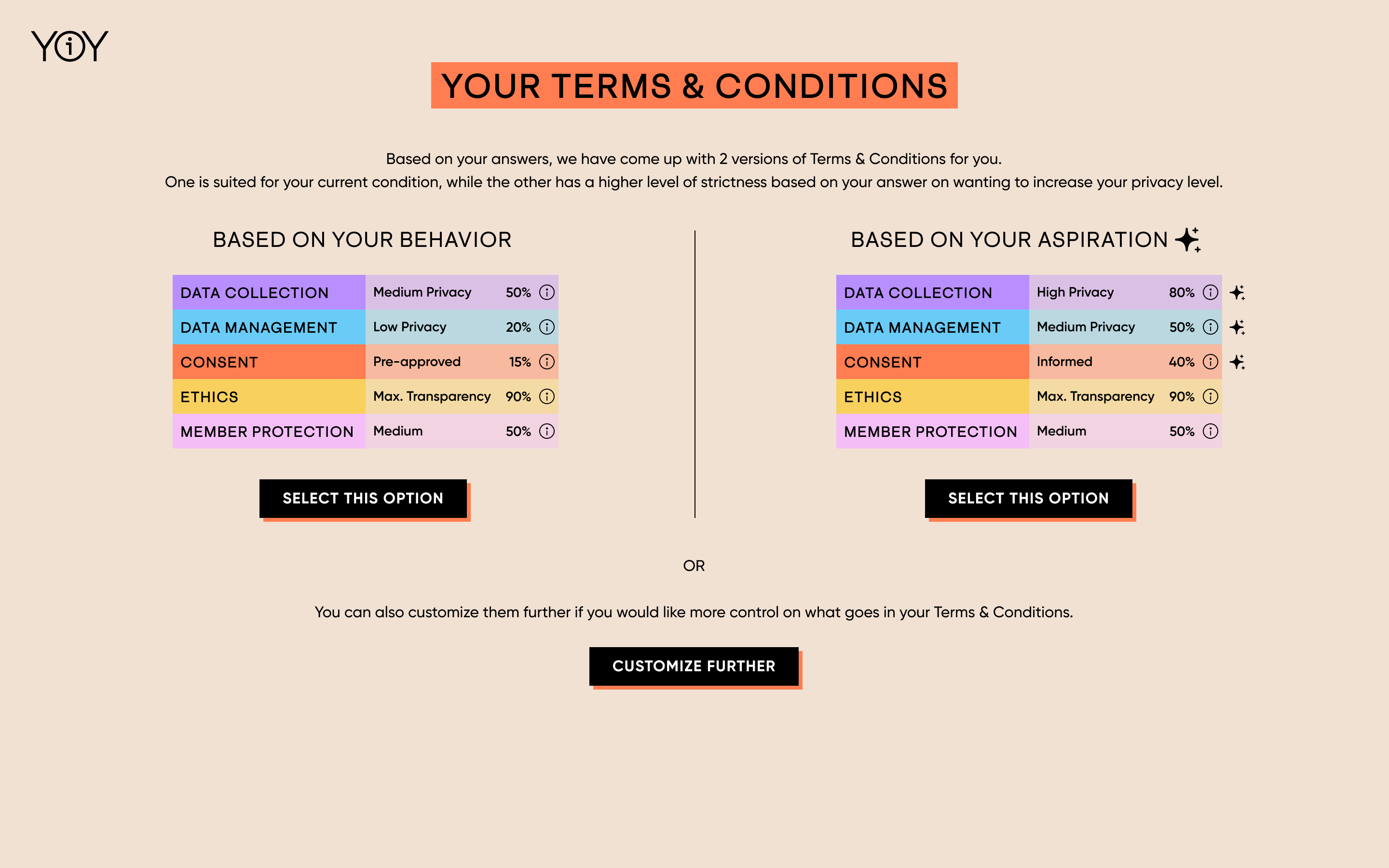
Terms & Conditions Customizer
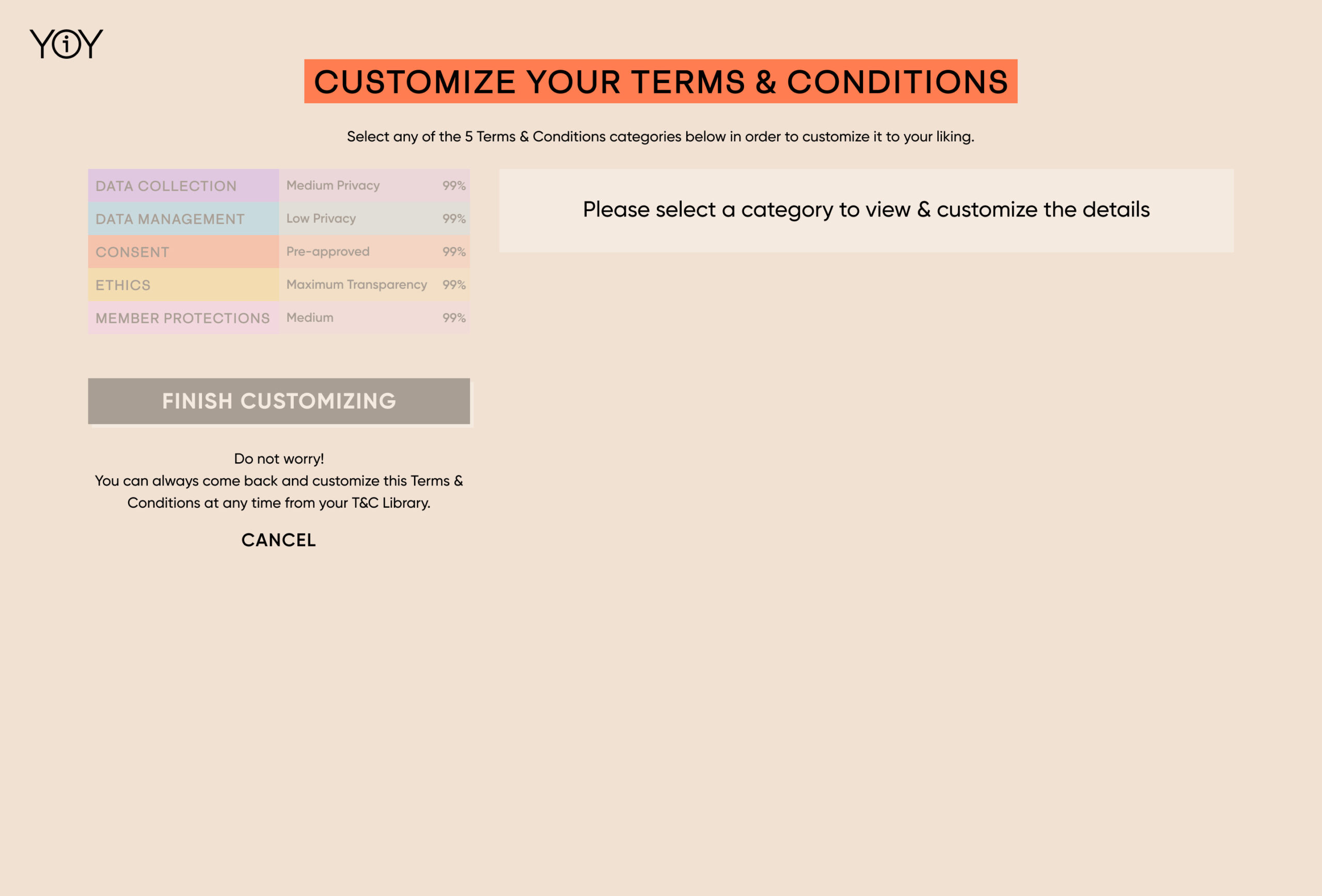
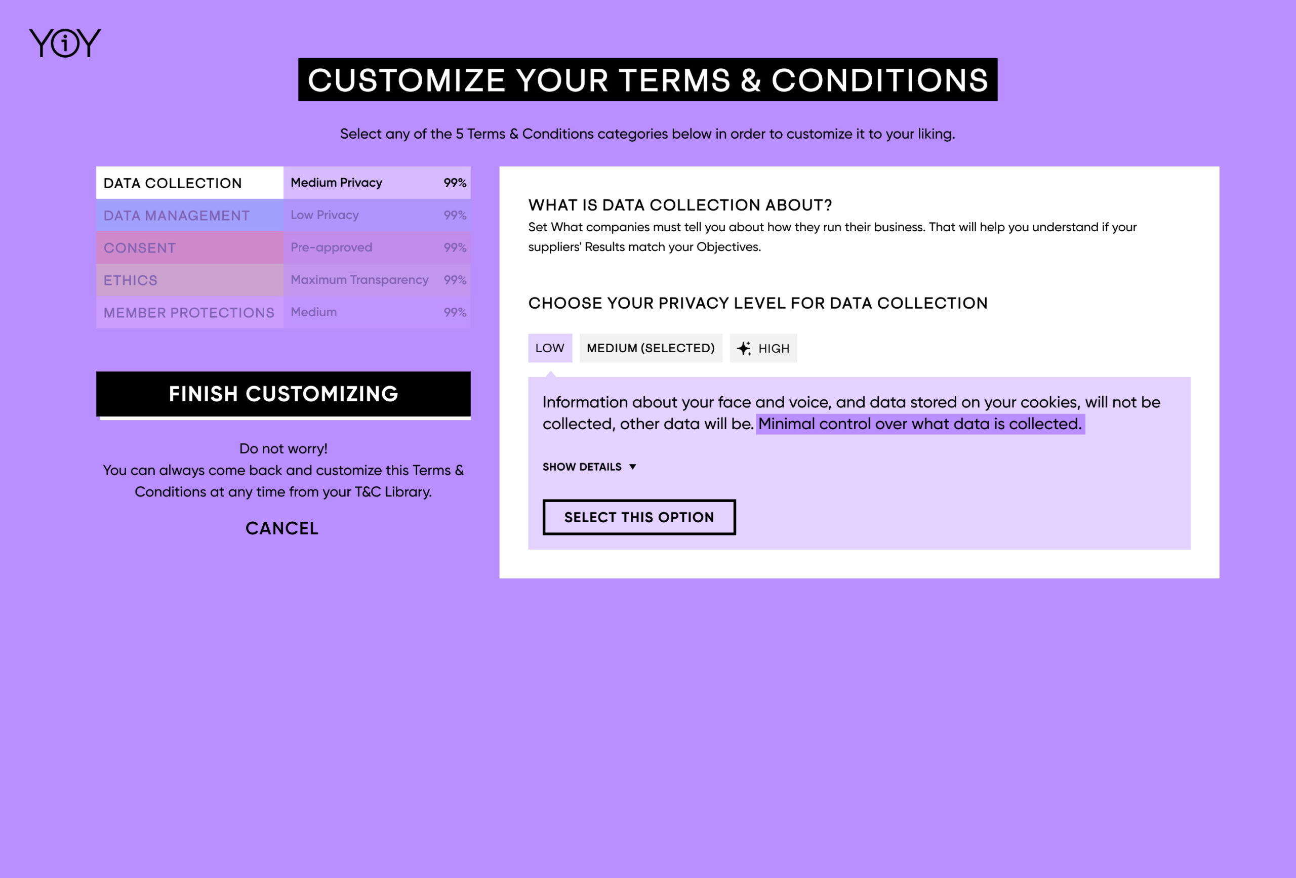
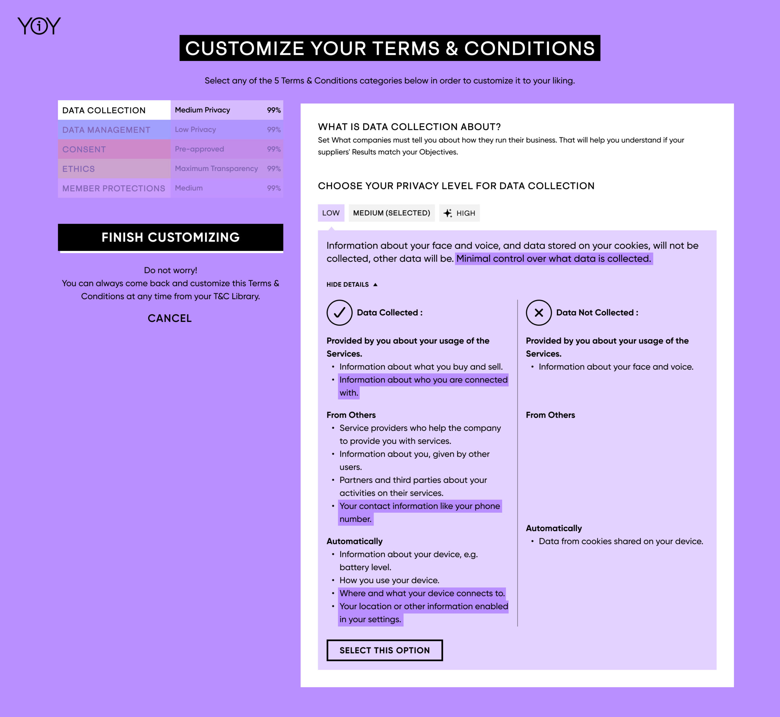
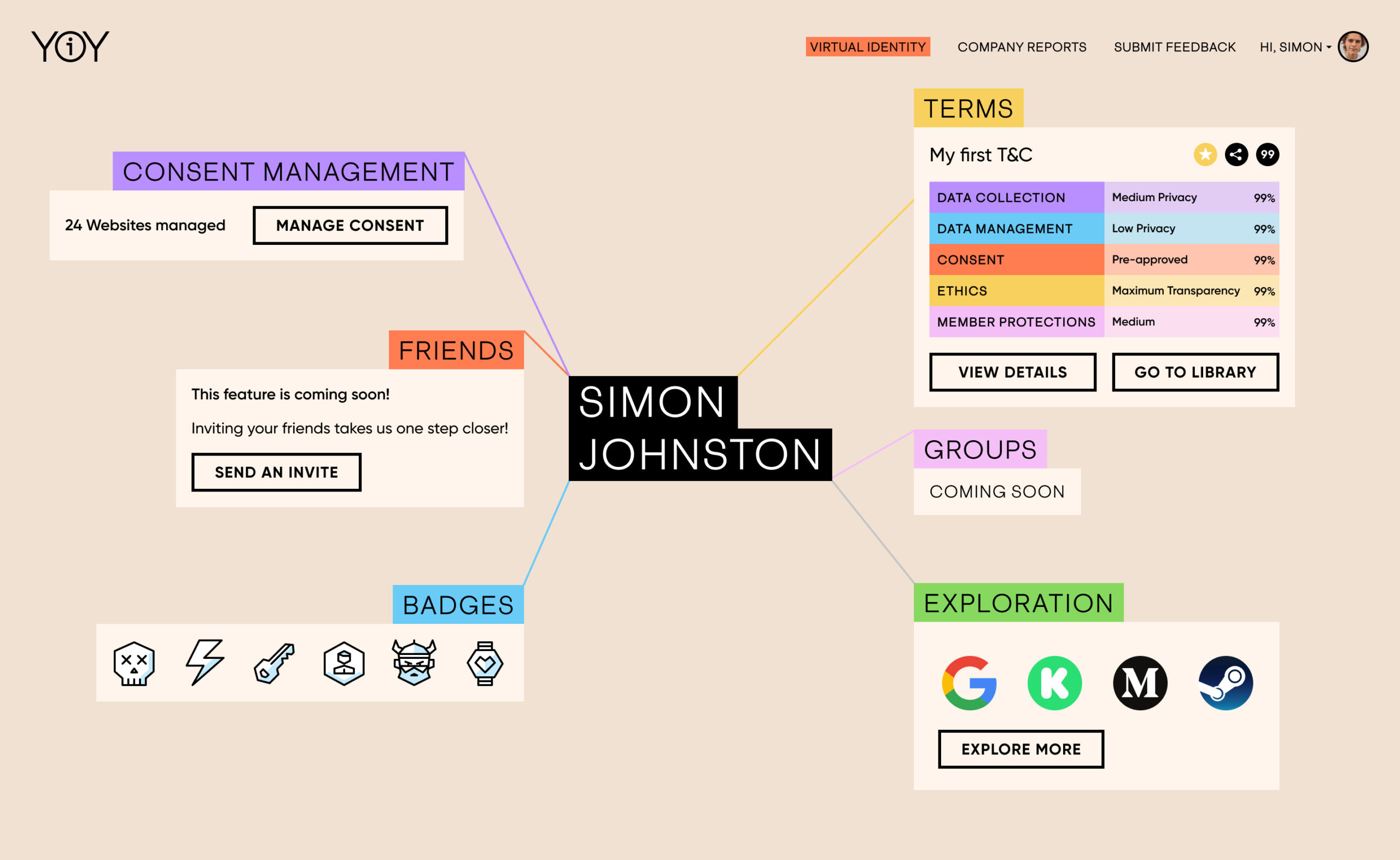
Virtual Identity Page
The Virtual Identity page is the central hub for our users in YouOwnYOu, where they can explore and use other features of the platform.
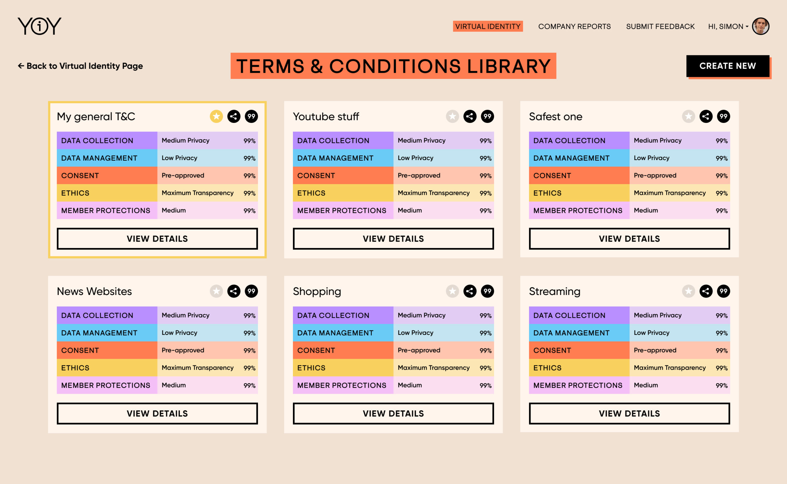
Terms & Conditions Library
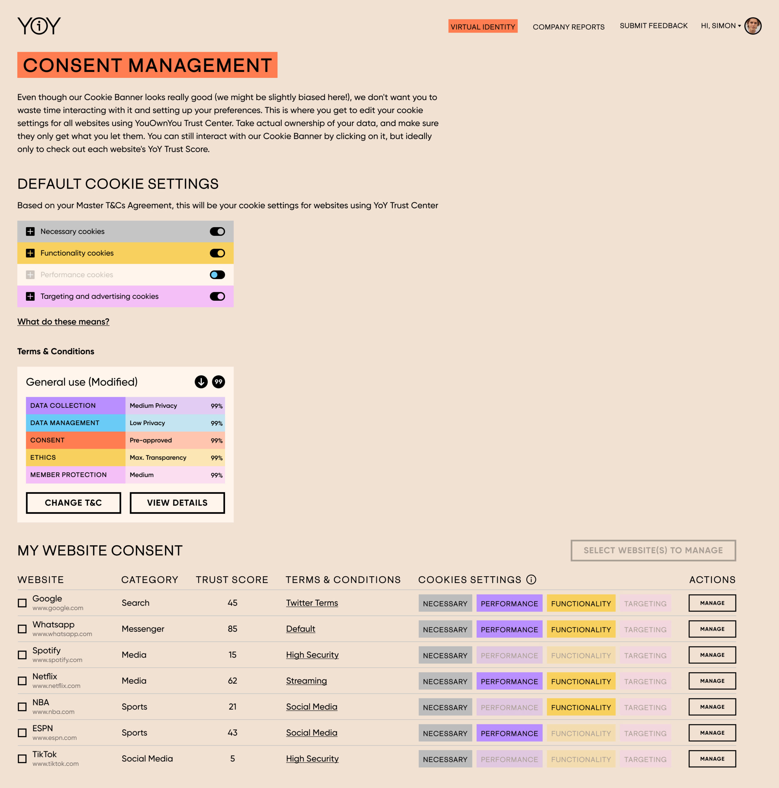
Consent Management Dashboard
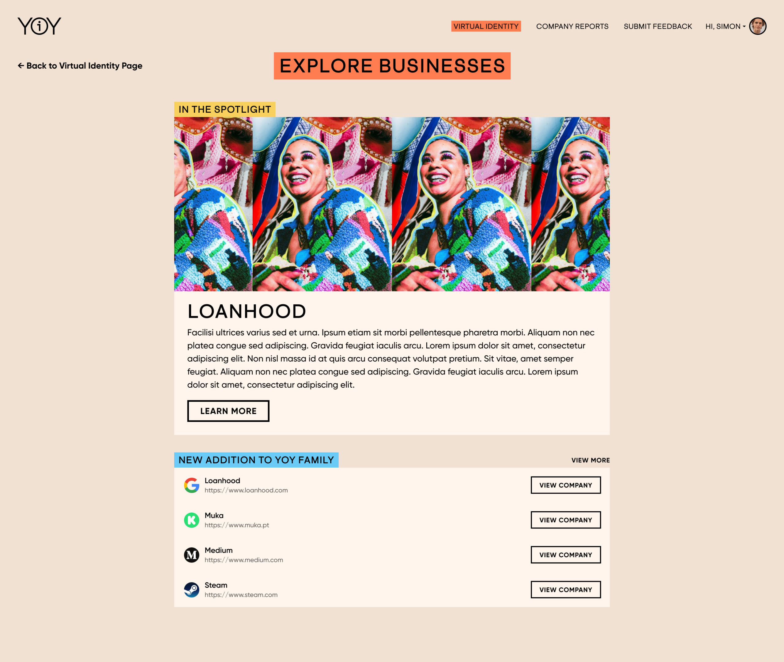
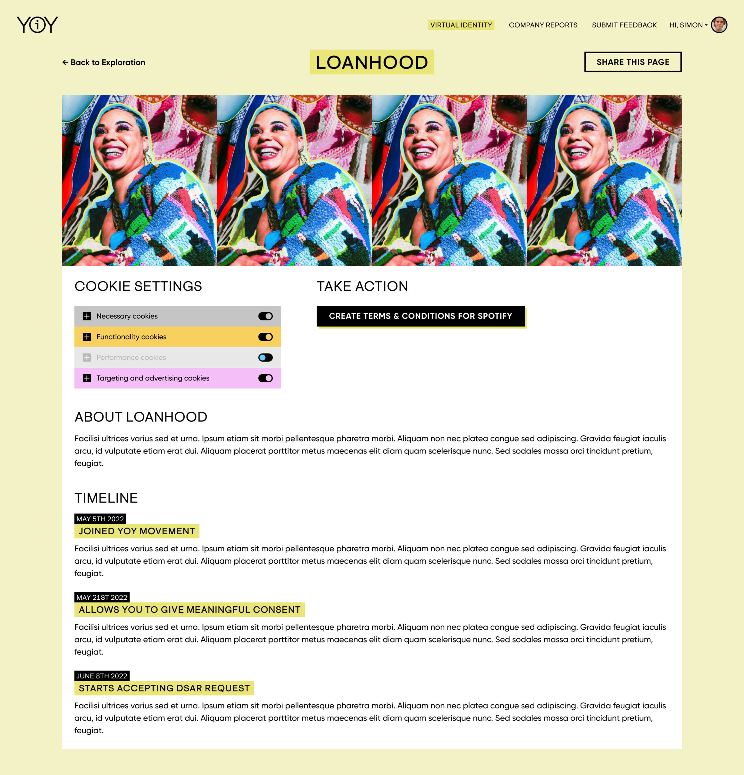
Brands Exploration
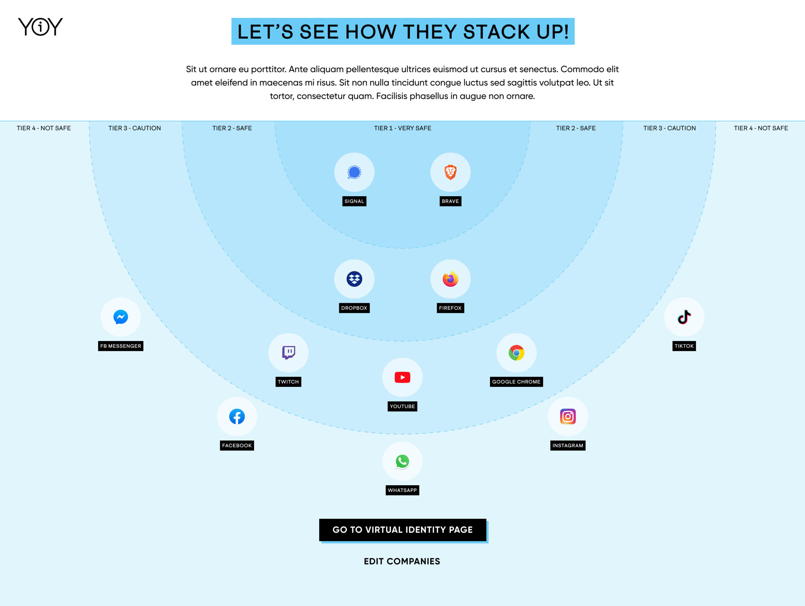
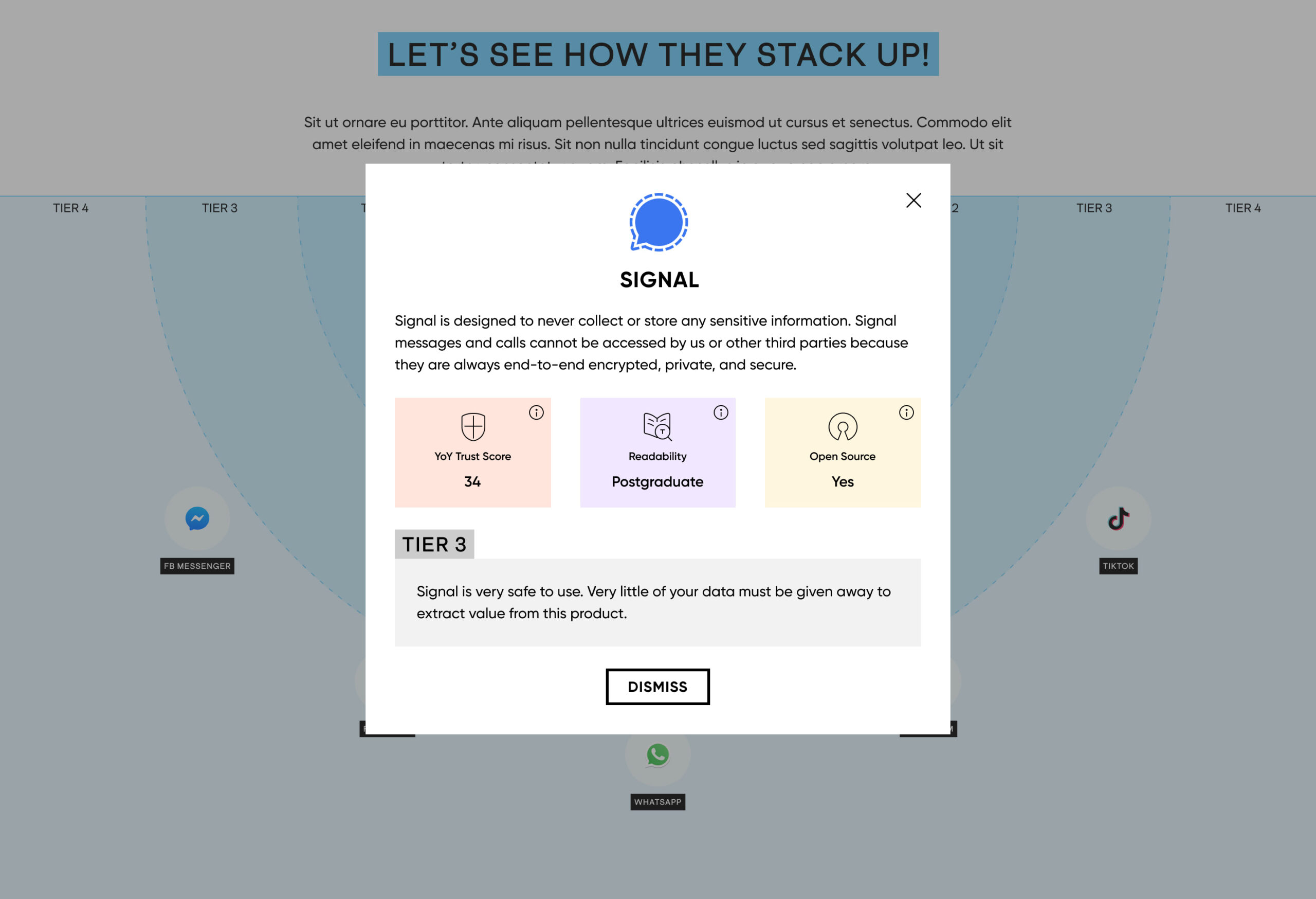
Company Reports
We can help solve your design problem.
Interested in working with us?
Shoot us an email at inquiry@155.138.130.223.
We can help solve your design problem.
Interested in working with us?
Shoot us an email at works@ligatsa.com.
See our other works
